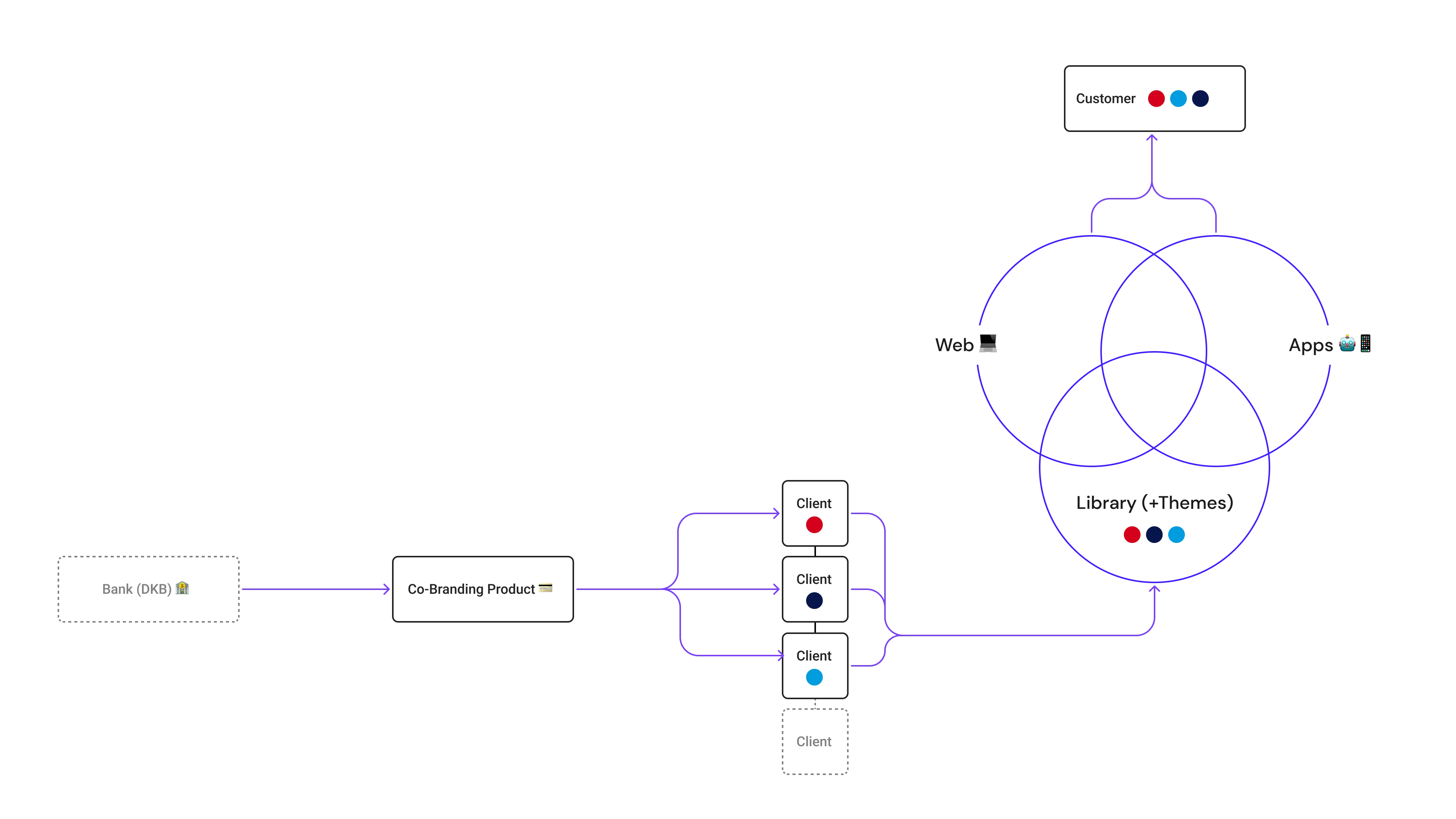
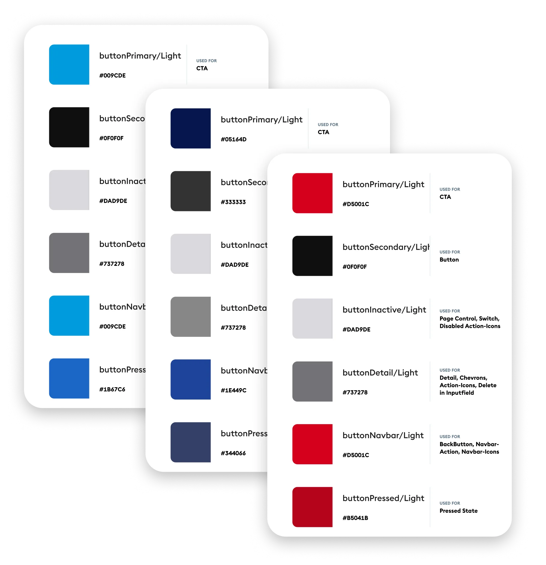
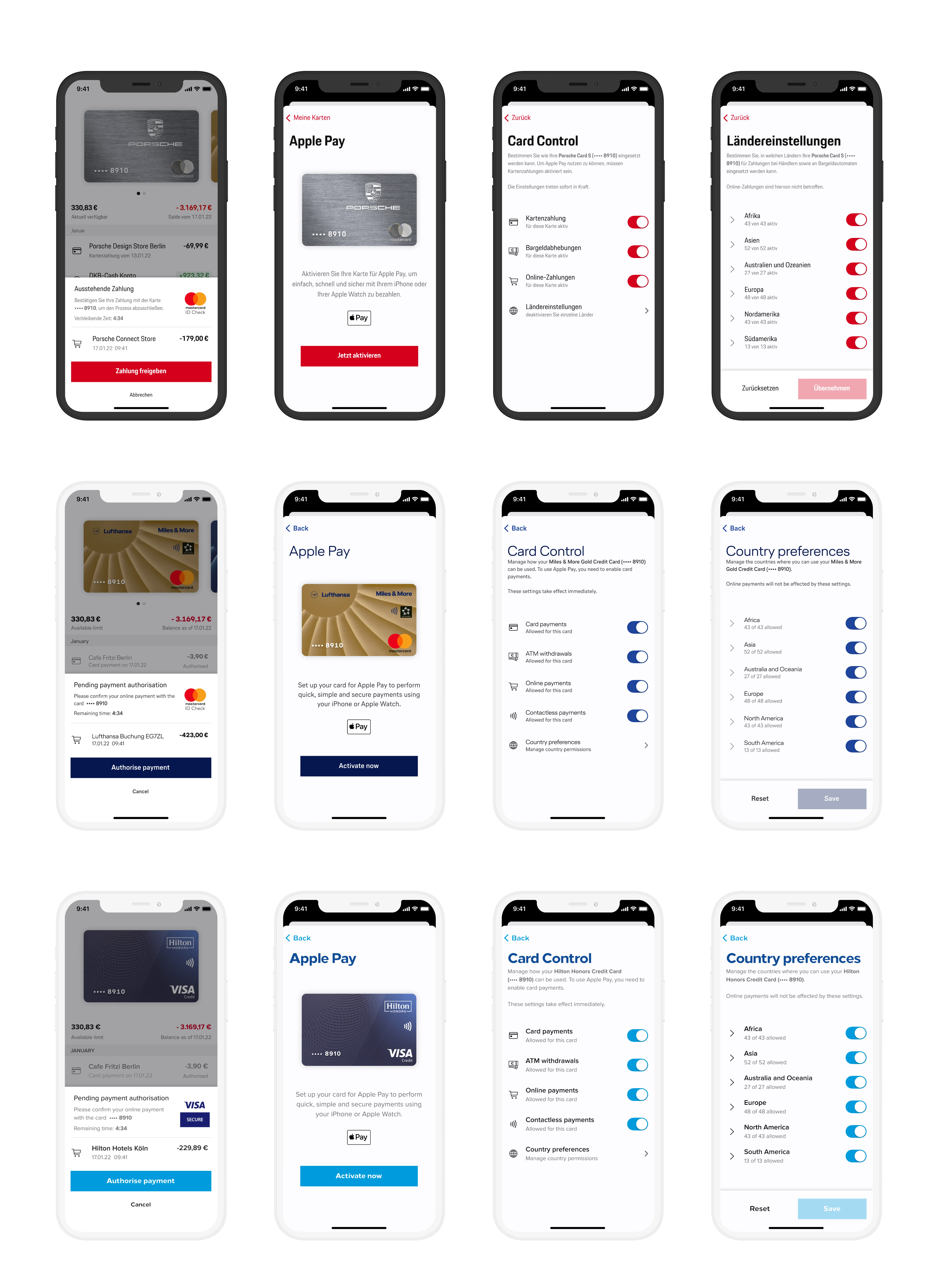
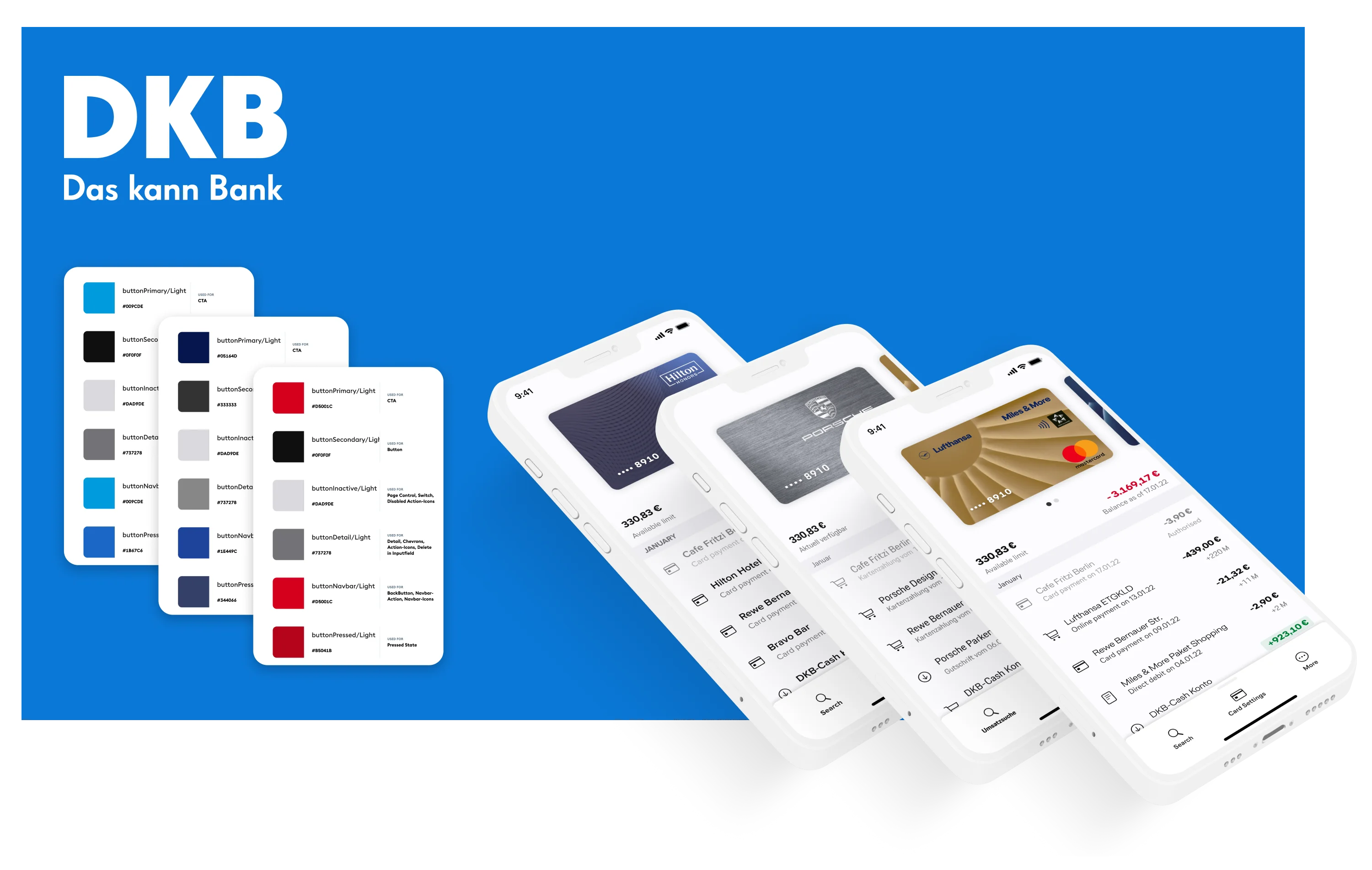
Co-Branding
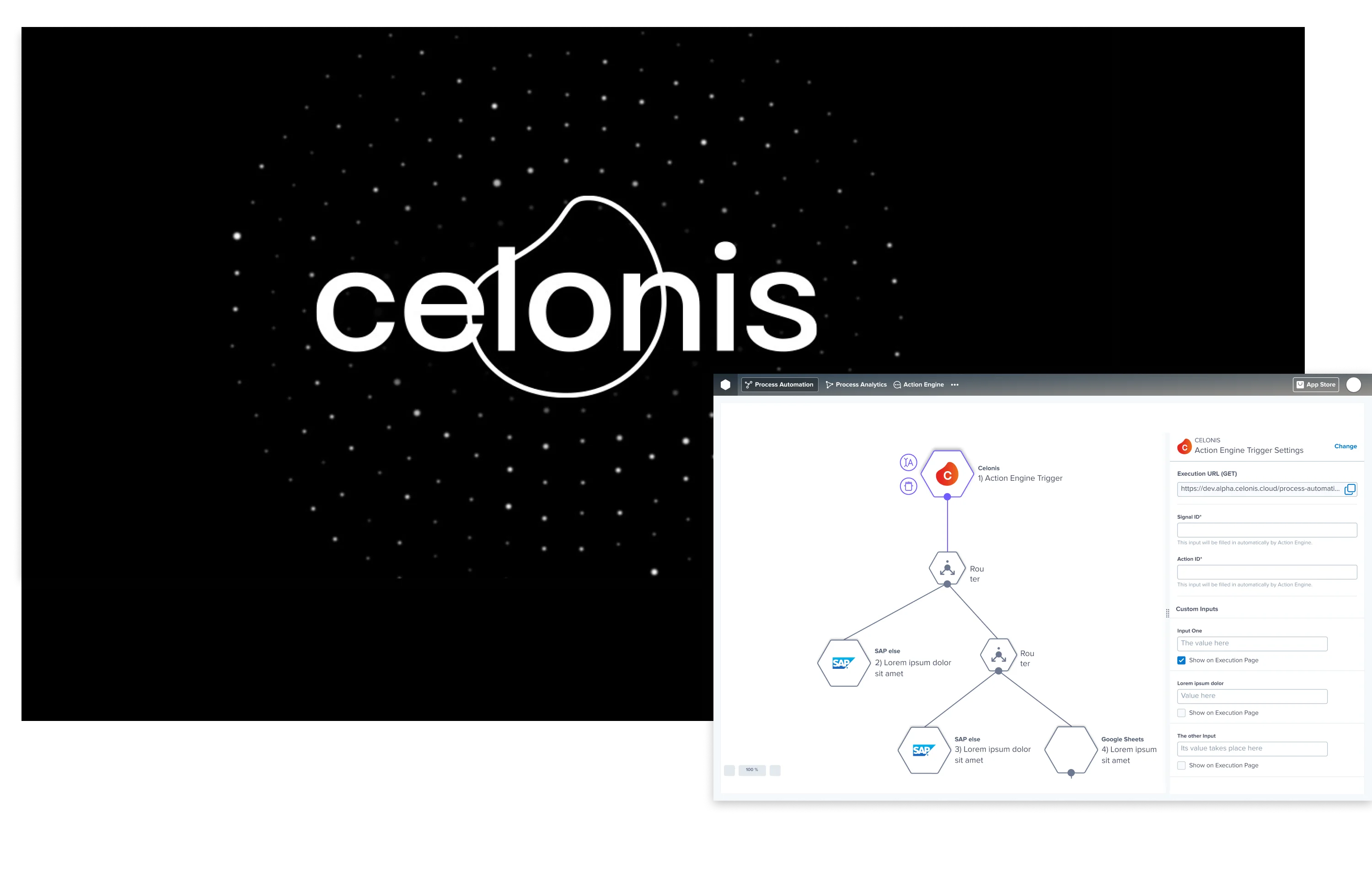
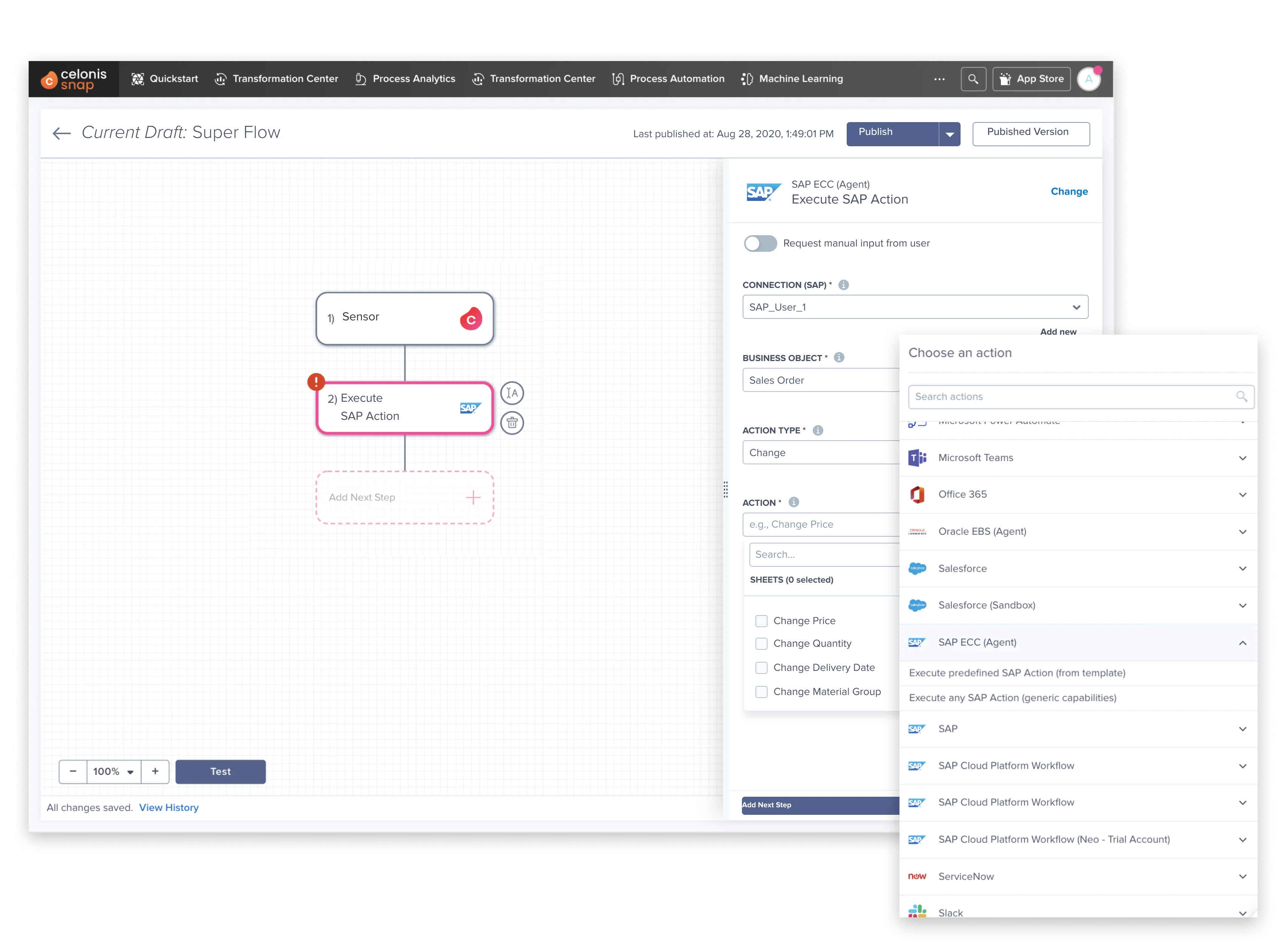
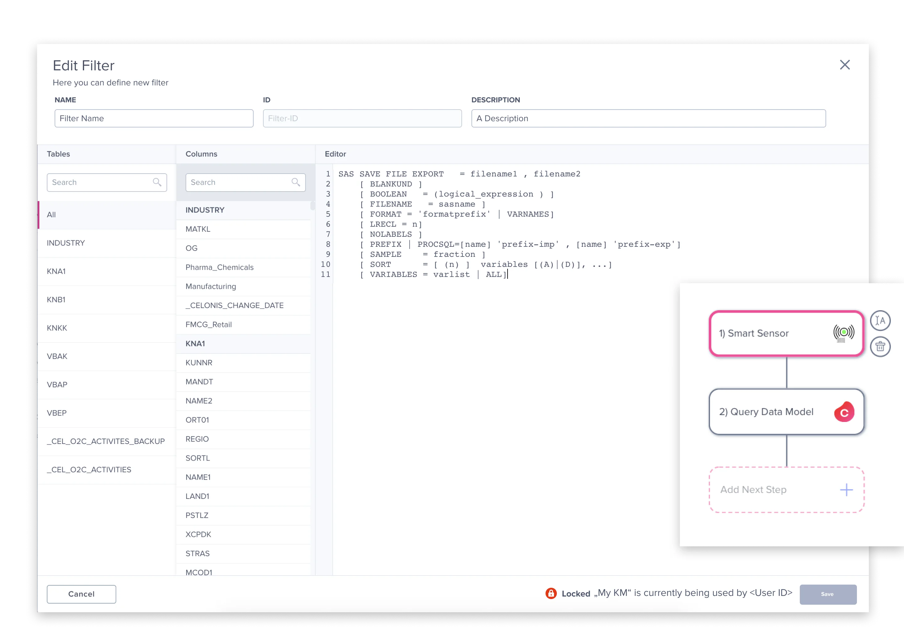
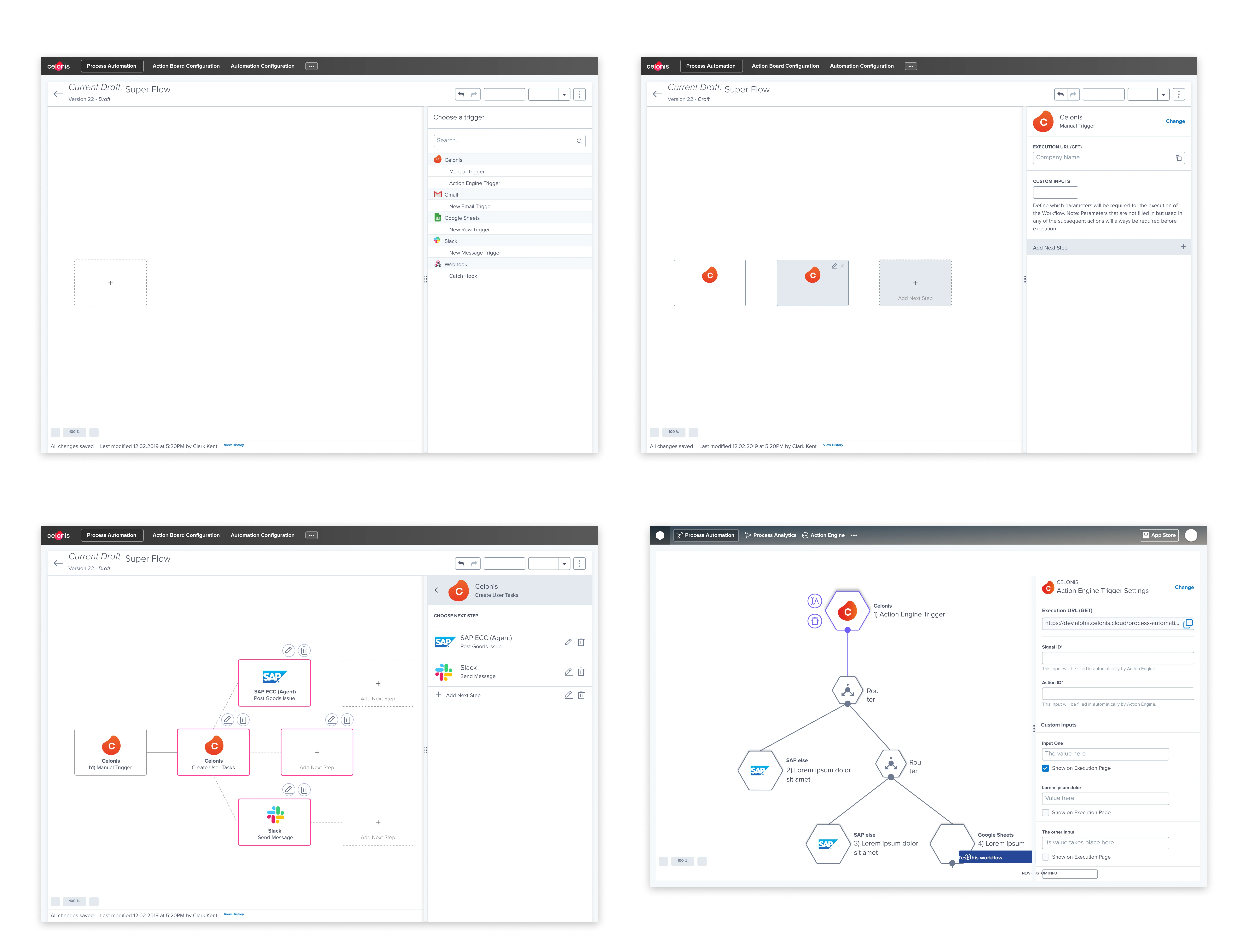
Process Automation
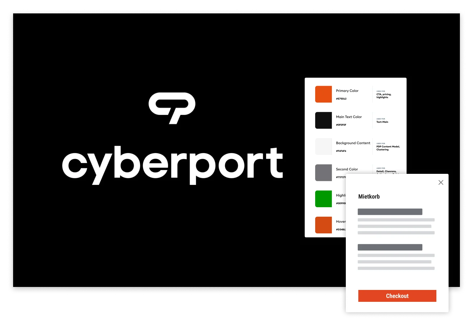
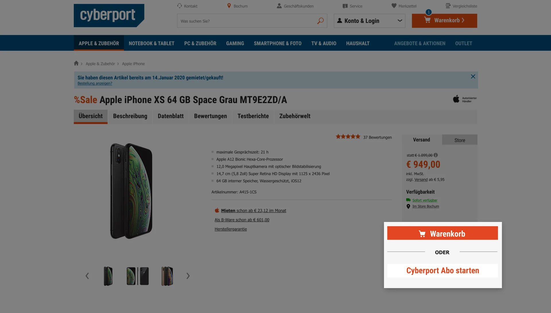
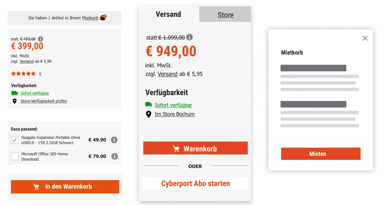
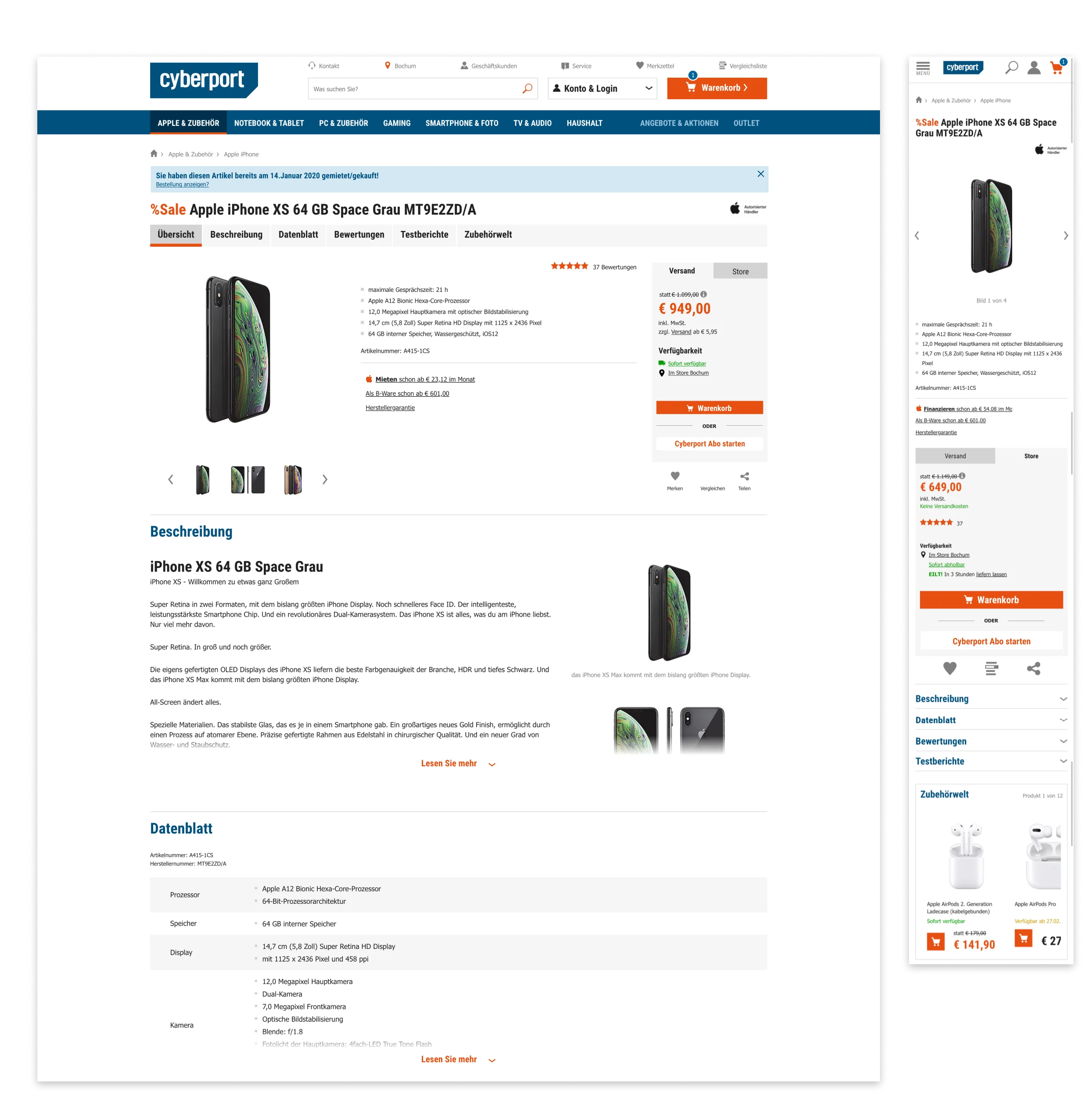
E-Commerce

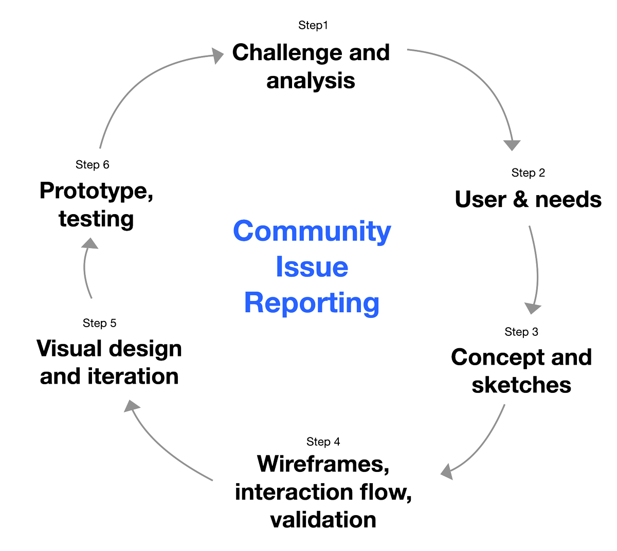
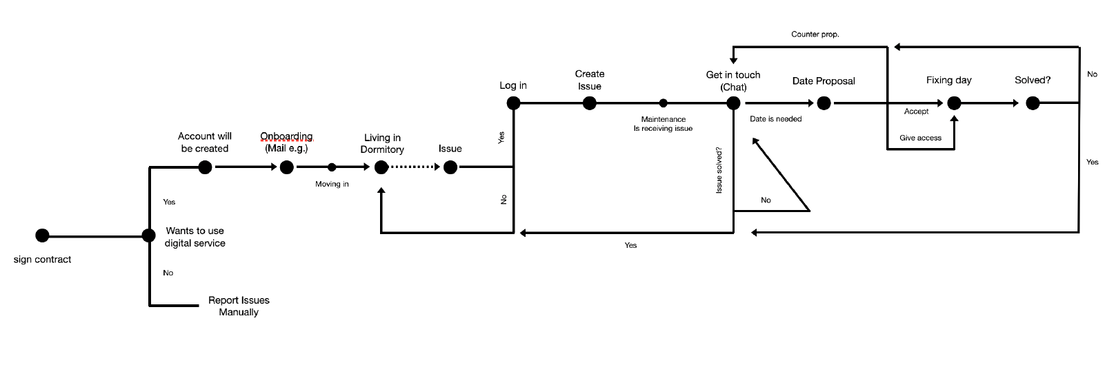
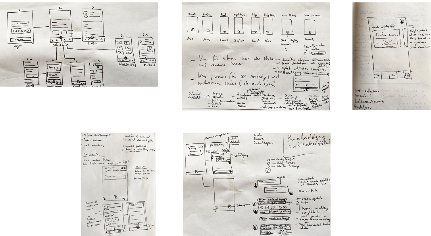
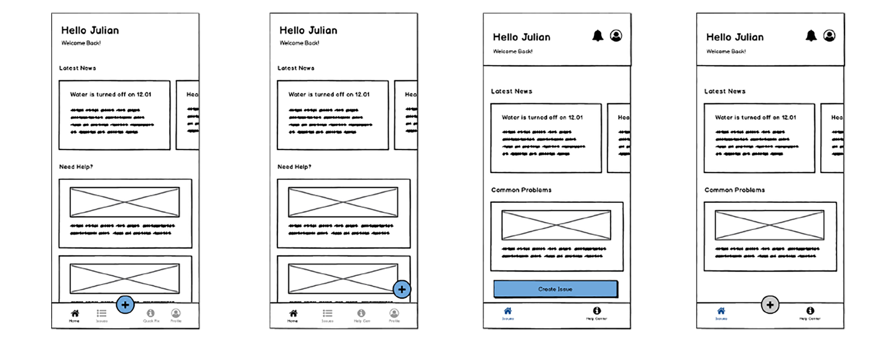
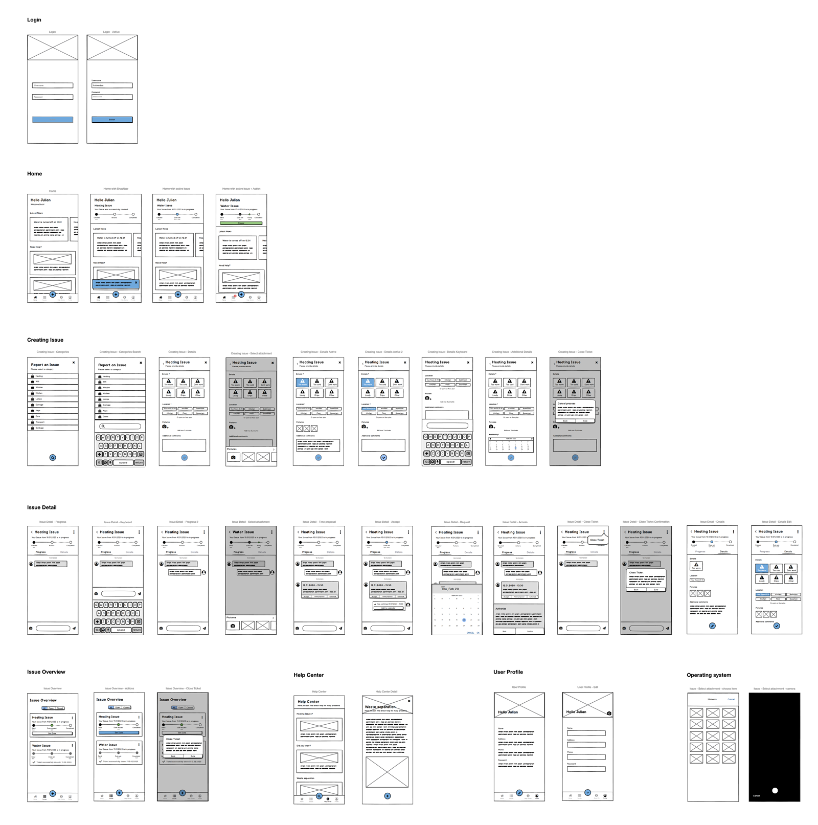
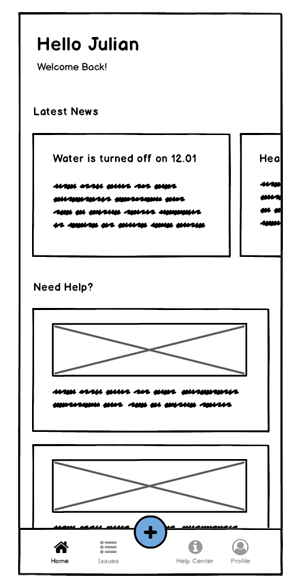
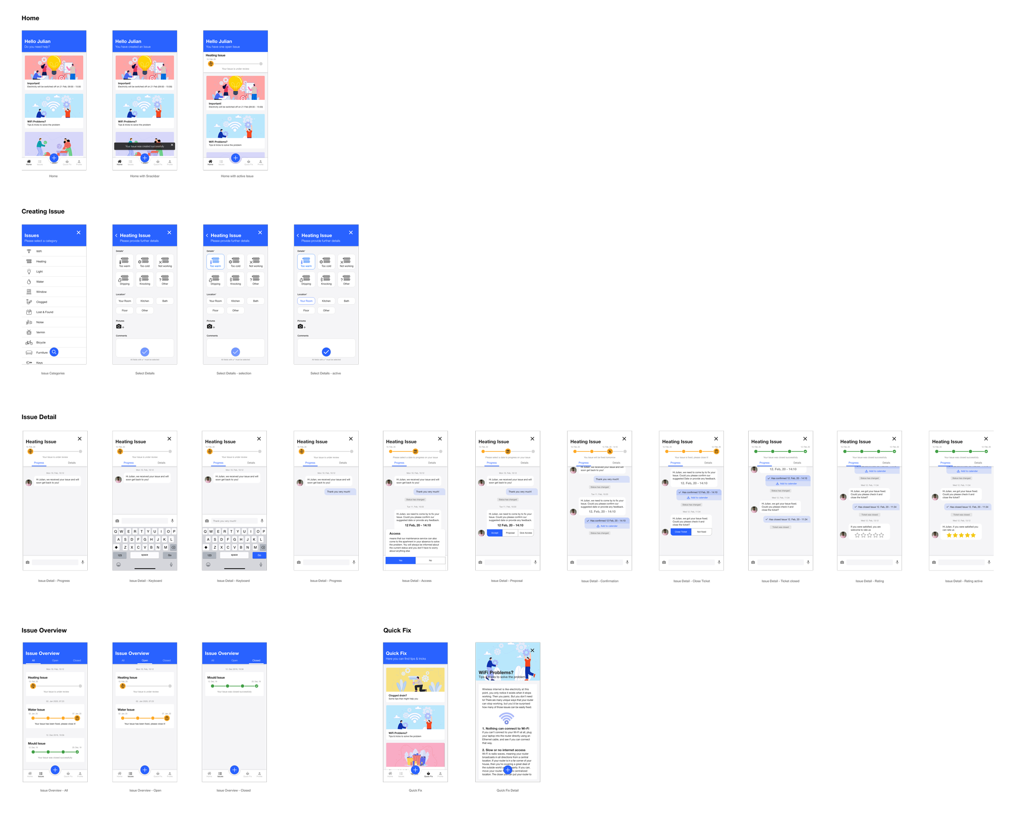
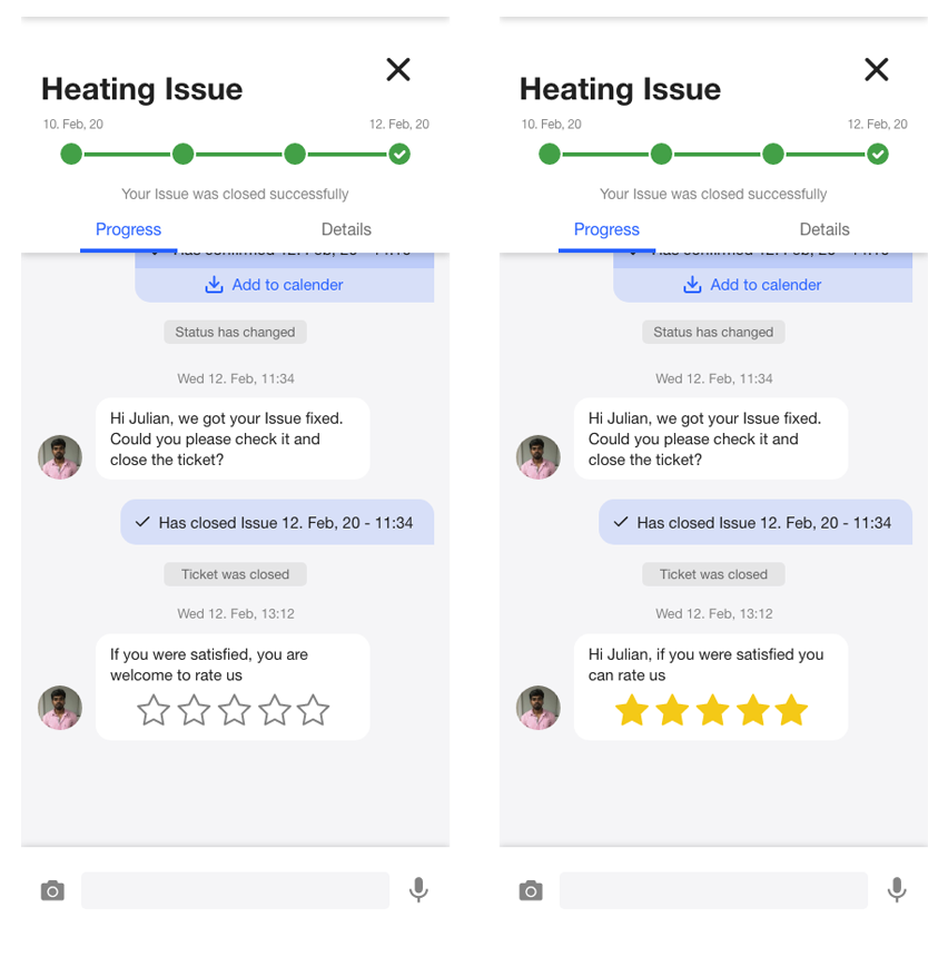
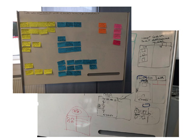
Community Issue Reporting

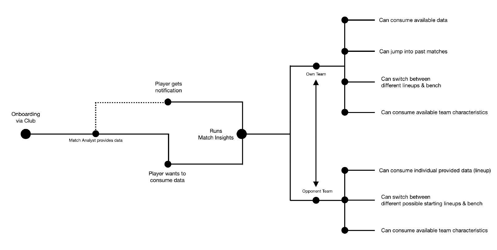
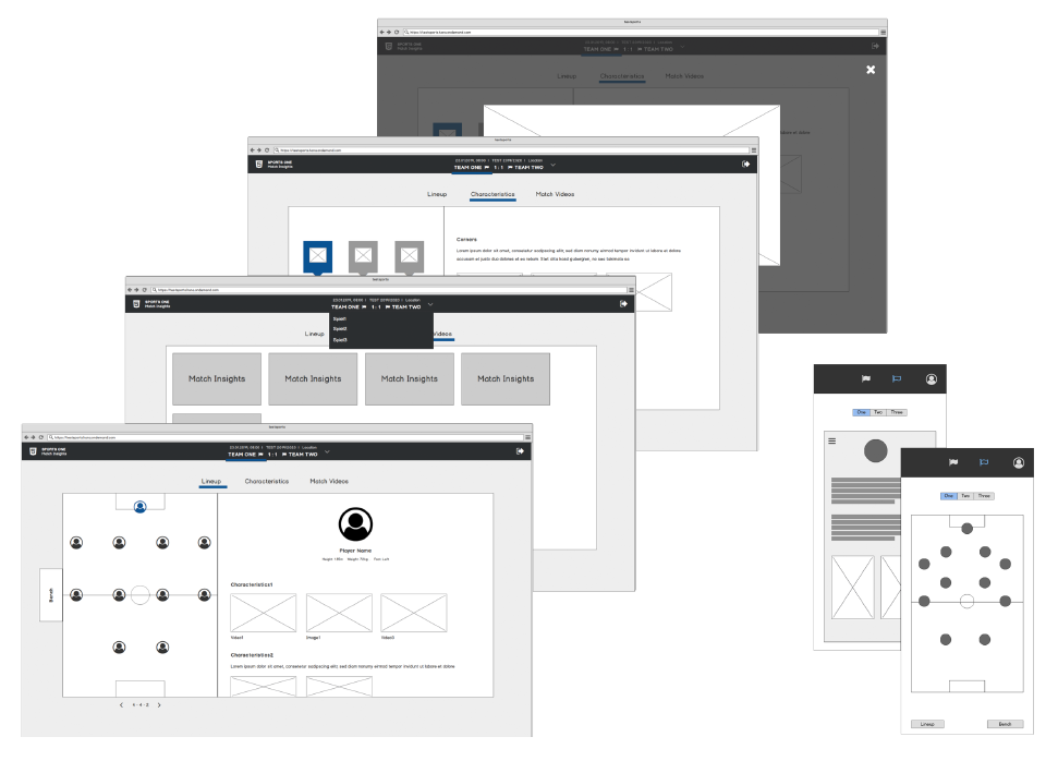
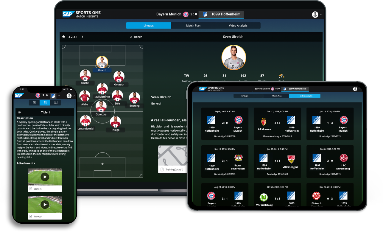
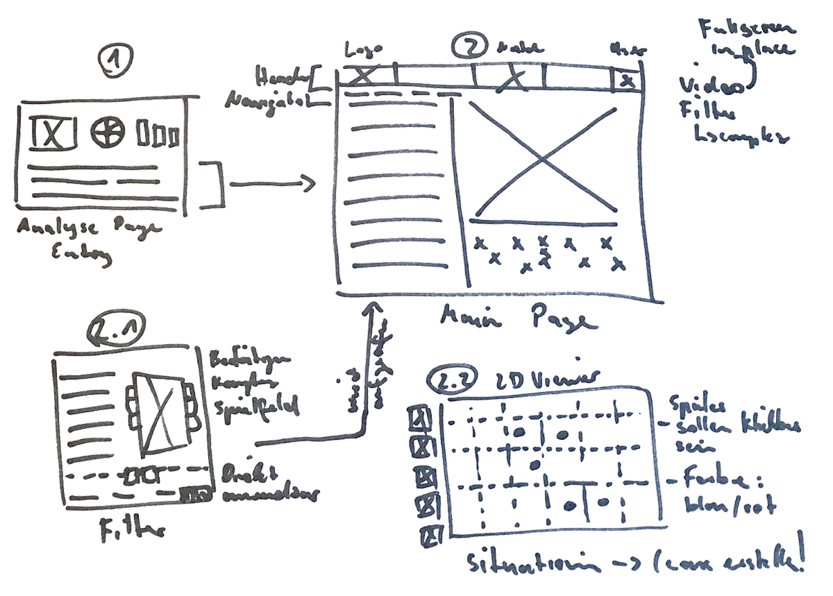
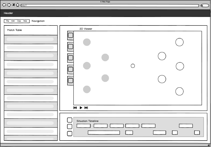
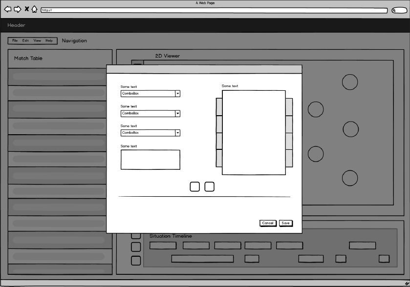
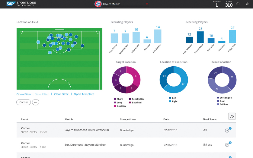
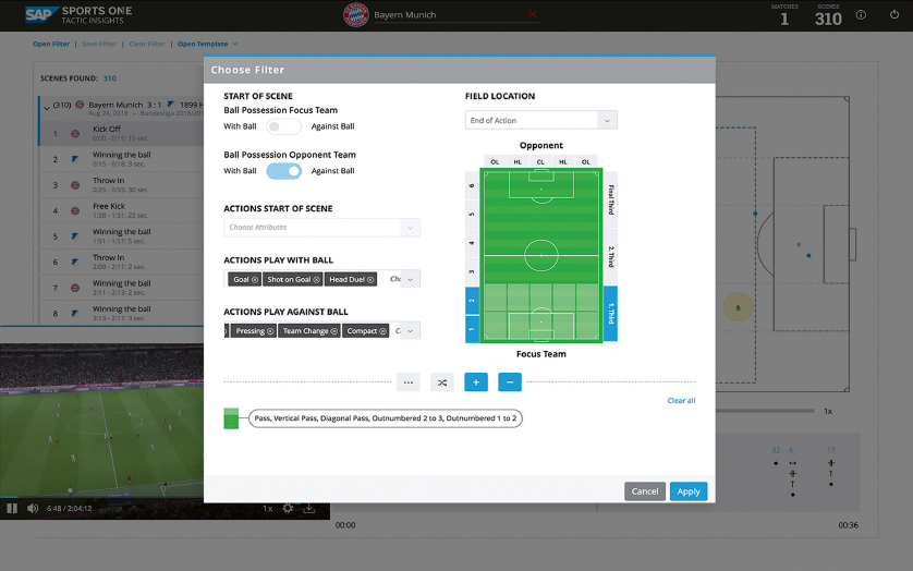
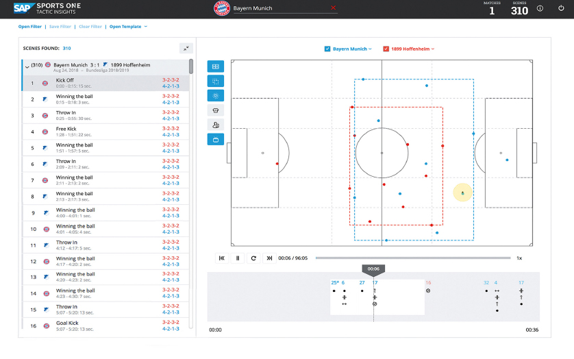
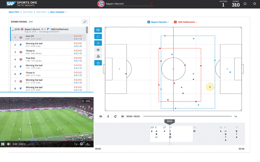
Game analysis

Machine Learning

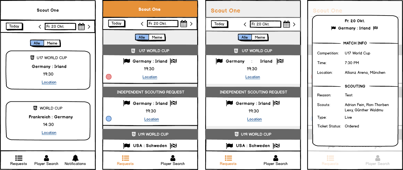
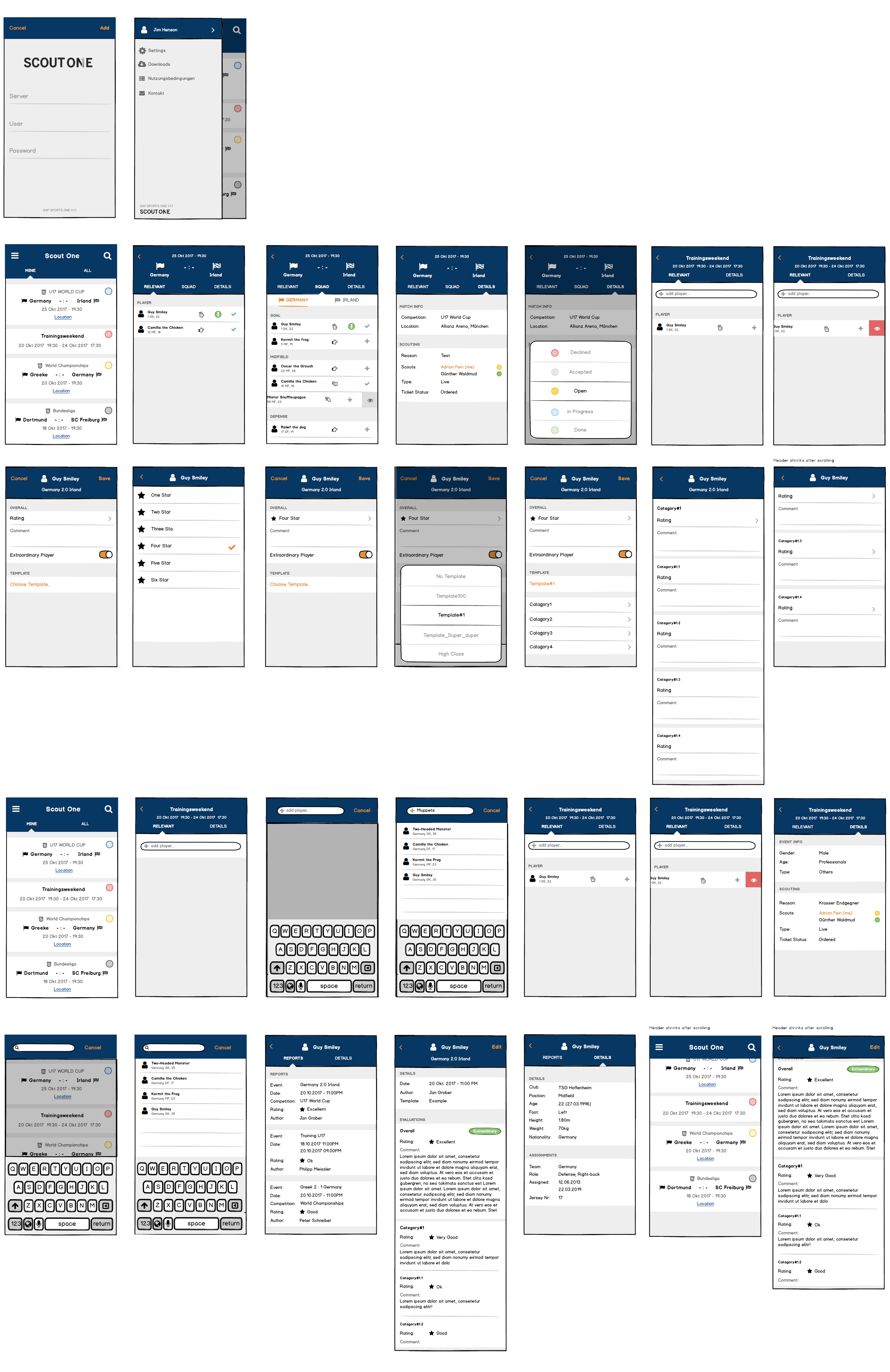
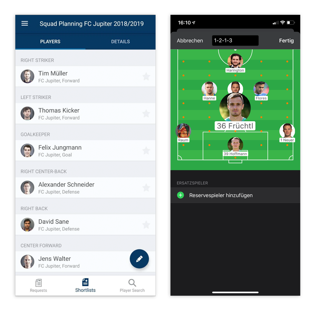
Scouting Platform